Soso by Eduardo del Fraile
26/03/2013
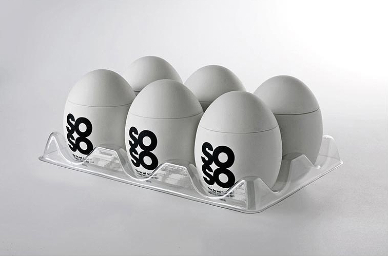
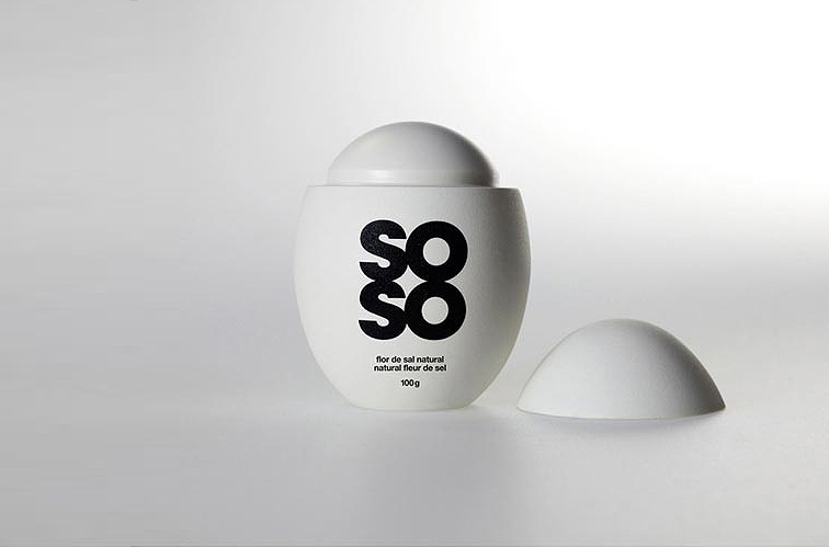
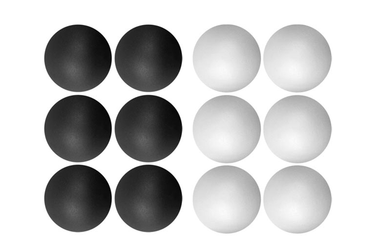
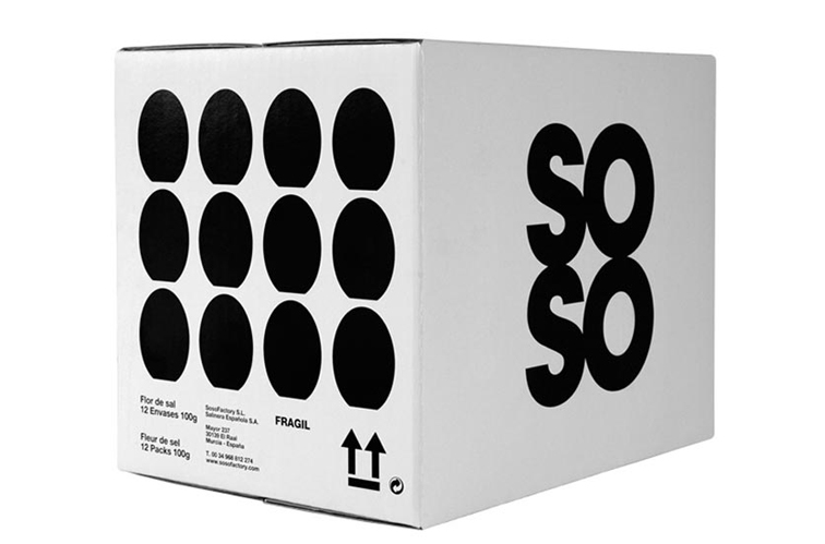
‘Soso is a brand of high-quality salt. The client was looking for a distinguishing packaging that would change the current reference in the delicatessen shelves. The salt comes from a salt mine right next to a nature reserve in Santiago de la Ribera, Spain. An egg is the perfect container, its own shell is the packaging, it was decided that the shape of the egg would be reproduced for the product container and salt cellar. Soso has different types of salt to cook with different flavours; the colour of each egg relates to its flavour. The project and the brand were named SOSO, which means “lacking salt or short of salt” in Spanish.
The whole project was developed within a 150 km-radius, this way the manufacturing environmental impact was significantly reduced. Sometimes, a graphic designer has to deal with three dimensions, this task can be very enriching if the project has a solid design basis. This project was especially interesting due to the existing relationship with the client José Ros and with Aurelia González, who helped me in the development of this work.’
Designed by Eduardo del Fraile | Spain
© 2026 Awesome Design Ideas
Leave a Comment
You must be logged in to post a comment.